
Get More Results from Your Website? Eliminate These 13 Outdated Website Features Today!
Are these outdated website features holding your website back? If the answer is yes, they might be significantly impacting your website’s user experience and conversions.
To create a clean, user-friendly website that is easy to navigate and understand, you need to eliminate any unnecessary website elements. This will not only improve the user experience and enhance website performance but can also lead to increased website traffic, improved search engine rankings, and, ultimately, more conversions.
This blog post highlights 13 key elements you should consider eliminating from your website to create a more effective design and improve user experience, as well as your results. It also provides website optimization hacks to help you enhance your website’s overall performance and, ultimately, convert your visitors into leads and sales.
1. Outdated Design Elements
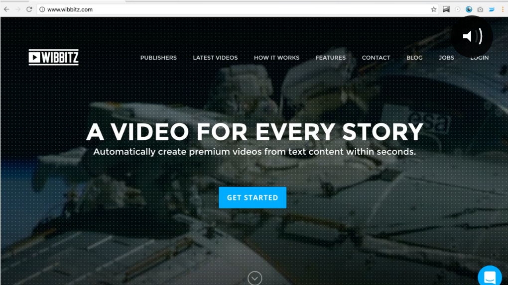
(Auto-Playing Videos) Credit: Wistia
When it comes to website design, less is often more. Your website’s design is the first impression visitors have of your business, so it’s crucial that it is user-friendly and looks modern. Outdated design elements can negatively impact the user experience and make your website appear unprofessional.
That said, removing outdated design elements that don’t conform to modern web standards is essential. Some obsolete design elements you should eliminate from your website include excessive flash content, overuse of stock images, auto-playing music or videos and outdated typography.
- Flash content: Flash content can slow down your website and might not be supported by most mobile devices.
- Stock images: Overusing stock images can make your website appear generic and unoriginal.
- Outdated typography: Outdated typography can make your website appear old-fashioned and difficult to read.
- Auto-playing music or videos: These can be disruptive and overwhelming for users, not to mention it can slow down your website speed.
- Busy layouts with cluttered text and images: Avoid busy layouts with cluttered text, according to a study by Google, websites that have high visual complexity are consistently rated as less beautiful and trustworthy by users. Instead prioritize clean lines, white space and easy readability.
- Flashing banners and pop-ups: Flashing banners can be disruptive, and although pop-ups have the potential to boost conversions, it’s essential to be mindful of user experience. To avoid intrusiveness, it’s advisable to implement a delay of at least 15 seconds before displaying a pop-up. It’s worth noting that, from an SEO perspective, Google penalizes websites with intrusive pop-ups.
2. Date on Blogs
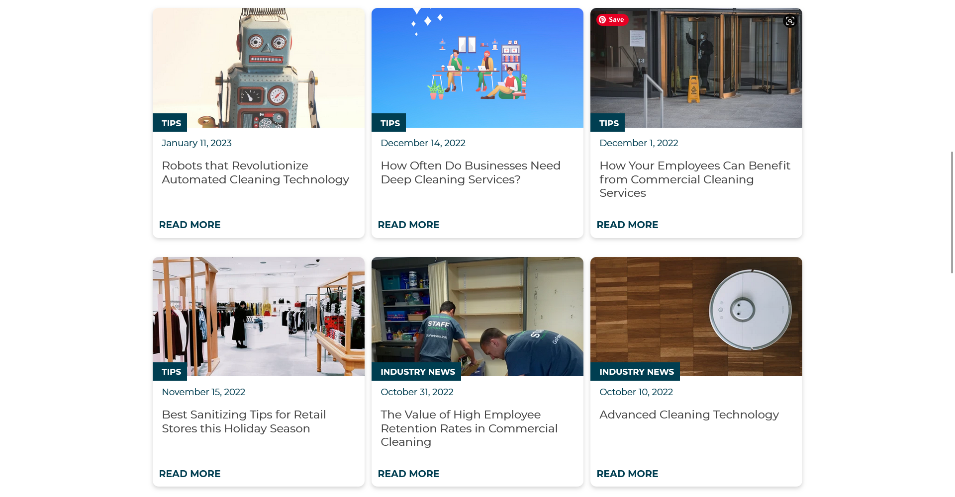
While including the publication date on blog posts may seem beneficial, it’s important to weigh the potential pros and cons. On one hand, displaying the date can provide transparency and indicate the freshness of the content. However, it can also have drawbacks.
- Credibility Impact: When visitors see an old date on a blog post, they may assume the information is outdated, impacting your website’s credibility, and diminishing user engagement. This perception can also affect your search engine rankings negatively since Google favors content freshness.
- SEO Consideration: From an SEO perspective, Google doesn’t directly penalize websites for displaying dates. However, users often use dates to gauge content relevance and accuracy by removing the date you’re showing that the content is evergreen and can be relevant at any time.
- Evergreen Content: Removing dates can suggest that your content remains valuable over an extended period, enhancing your website’s professionalism and the perceived value of your content while potentially increasing engagement, especially if your blog doesn’t receive frequent updates.
3. Unclear Call-to-Action Buttons
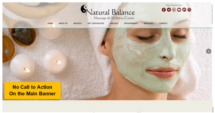
The effectiveness of your website relies heavily on its ability to guide visitors towards specific actions. These crucial elements, commonly known as Call-to-Actions (CTAs), play a pivotal role in engaging users and driving conversions.
Users should quickly and easily understand what action to take when they visit a website. One of the most prevalent mistakes in CTA design is the absence of CTAs, leaving visitors without clear pathways to engage.
Equally detrimental is the creation of confusing or unclear call-to-action buttons. Poorly designed CTAs can lead to confusion and frustration, ultimately affecting your website’s performance. To ensure that your website has effective CTAs, make sure that they are highly visible, ensure that your CTA button copy is clear and concise while utilizing contrasting colors to make it stand out from the rest of the page. Avoid vague or ambiguous language and be specific about the expected outcome when users click your Call-to-Action.
4. Overly Complex Navigation
Your website’s navigation is one of the most important elements of the user interface. It helps visitors find the information they need and allows them to move around your site easily. However, overly complex navigation or too many navigation options can overwhelm and confuse users.
In fact, it can make it difficult for visitors to find what they’re looking for, leading to frustration, and potentially causing them to leave your site. Poor navigation structure can also make it harder for search engines to crawl and index your site, negatively impacting your SEO efforts.
To simplify your navigation and streamline your user interface, consider the following tips:
- Keep it simple: Most of the time, simplicity is key. Use clear and descriptive labels for your navigation links and avoid using too many submenus on drop-downs. This can help visitors quickly find what they need and reduce confusion.
- Use a logical structure: Organize your navigation links in a logical order that makes sense to your visitors. Group related pages together and use descriptive labels that accurately reflect the content of each page.
- Make it easy to find: Your navigation should be easy to find and accessible from every page on your site. Consider using a fixed navigation bar or a hamburger menu that expands when clicked.
- Group similar pages together: Grouping similar pages can make it easier for website users to find what they’re looking for. For example, consider grouping all of your blog posts under a single menu item if you have a blog.
- Limit the number of menu items: Limiting the number of menu items (drop-down menus or submenus) can make it easier for your users to navigate your website. Consider adding ideally 7 but no more than 9 menu tabs.
Simplifying your navigation and improving your user interface can create a better experience for your visitors and improve the site’s overall performance.
5. Testimonials Page
Testimonials are an excellent tool for building trust with potential customers, but dedicating a separate testimonials page on your website may not yield the best results.
A more effective approach is to integrate testimonials seamlessly throughout your website, especially on relevant product or service pages, as they play a crucial role in the conversion process. Placing testimonials directly on these pages ensures that visitors have easy access to the information they need to make informed decisions without leaving the page.
6. Avoid These Common Headline Mistakes
Your website headlines serves as the initial impression for visitors when they arrive at a website. It should be actionable, concise, engaging, and immediately capture the visitor’s interest. Unfortunately, some websites make the critical error of using vague or irrelevant headlines that fail to captivate the audience.
One prevalent mistake is the use of generic headlines that lack any meaningful value for the visitor. For instance, a headline that simply reads “Welcome to our website” offers no insight into the business or what the visitor can anticipate. Using Welcome in your headlines are rarely a good idea. It’s essential to create a website headline that is specific to your business, highlighting its unique attributes and distinguishing it from competitors.
Another misstep is presenting a headline that is overly long or complicated. Visitors should be able to grasp the essence of the headline at a glance. A lengthy or intricate headline can overwhelm visitors, potentially leading them to exit the website prematurely. Keep the headline succinct and direct to ensure a positive user experience.
Finally, avoid using a headline that is too salesy or promotional. Visitors want to feel like they are in control of their purchasing decisions, and a headline that is too promotional can turn them off. It is important to strike a balance between promoting the business and providing value.
7. Social Icons

Linking to social media icons can be an effective way to expand your social following and provide an additional touchpoint with your audience. However, it’s essential to remember that your website serves as the central hub for generating leads and sales. Consequently, your social media icons should not overshadow your website’s primary call to action. The goal is to strike a balance: while you want to connect with your audience on social platforms, you also want to keep visitors engaged on your website.
Ideally, social media icons should be strategically placed, often in the website footer. This placement ensures they are accessible for those who wish to connect on social media without diverting visitors away from your main website content and calls to action.
Use simple, minimalist icons that match the website’s color scheme and design, and preferably put them in the website footer.
8. Long Paragraphs
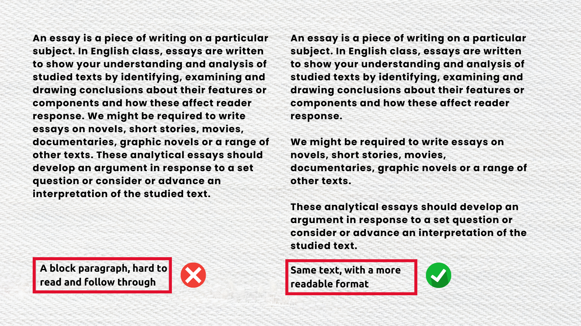
Long paragraphs can overwhelm website visitors and deter them from reading your content. Faced with a massive block of text, readers are more likely to bounce from the website, leaving it. Therefore, it’s crucial to keep your paragraphs short and concise, ensuring that visitors can quickly scan and grasp your message.
Here are practical tips for effectively breaking up lengthy paragraphs:
- Utilize Subheadings: Incorporate subheadings to segment your content into smaller, more manageable sections. This approach allows readers to navigate your text with ease, finding the information they need effortlessly.
- Embrace Bullet Points and Numbered Lists: Highlight key points using bullet points or numbered lists. These formats draw attention to essential information, making it stand out amidst the content.
- Apply Text Formatting: Utilize bold or italicized text to emphasize crucial details within your paragraphs. This technique guides readers to key takeaways and enhances comprehension.
- Keep Sentences Brief: Craft shorter sentences to make your content more digestible. Clear and concise sentences are more reader-friendly and maintain engagement.
By following these techniques, you can significantly improve the accessibility and user-friendliness of your content.
9. Dead End Thank You Pages

When a visitor submits a form on your website, it’s common practice to redirect them to a thank you page. However, if this page doesn’t offer any further action or information, it becomes a dead end. Dead-end thank-you pages can be frustrating for visitors, and they can also hurt your website’s performance.
To avoid this, make sure to include a call to action on the page. This can be a link to related content, a request to follow your social media accounts, or an invitation to sign up for your newsletter. Including a call to action will keep visitors engaged with your website and encourage them to return.
10. Overly Complex Forms and Surveys
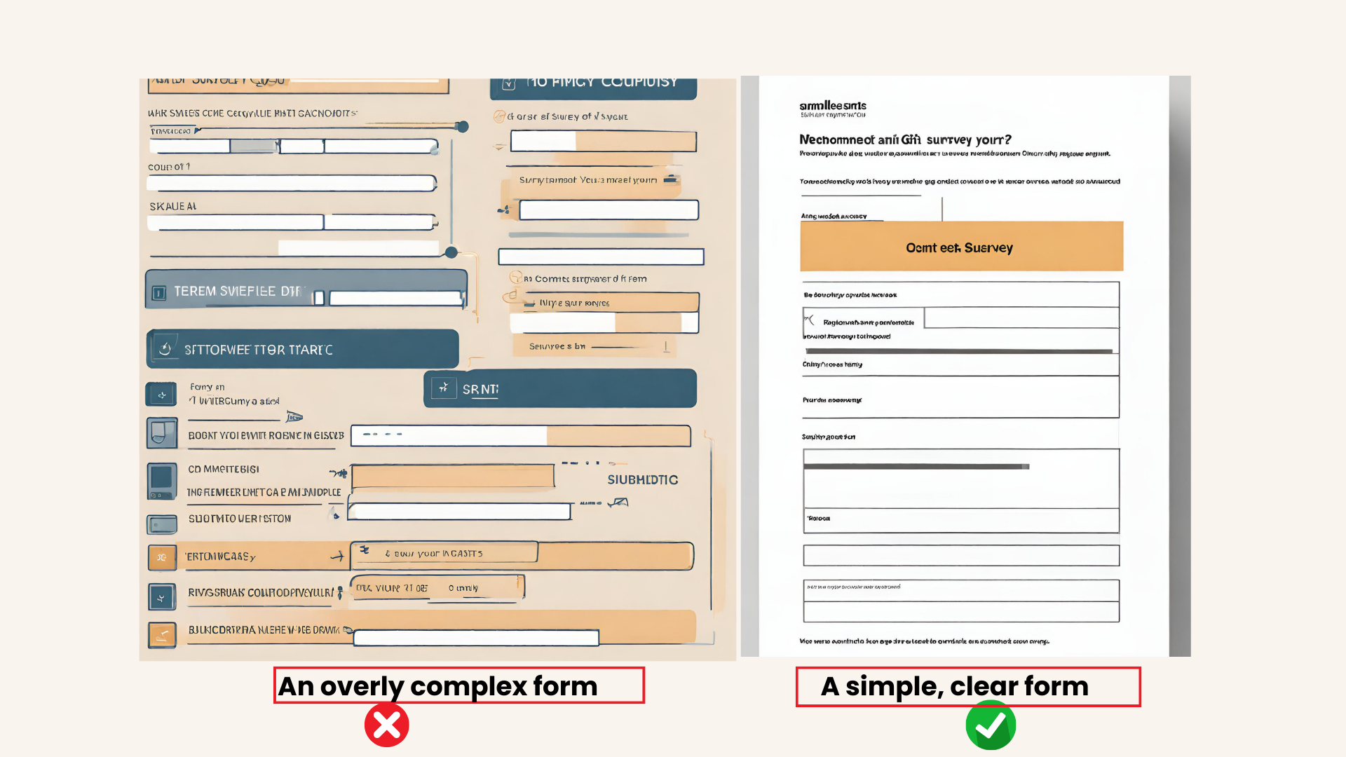
When it comes to forms and surveys, simplicity is key. Complex forms can be overwhelming, , and time-consuming for users, leading to frustration and decreased participation. Addressing the need for simplicity in forms and surveys is crucial for increasing user participation.
To simplify your forms and surveys, consider the following tips:
- Reduce the number of fields: Only ask for absolutely necessary information. The more fields you have, the longer it takes for users to complete the form. This can result in users abandoning it altogether.
- Use clear and concise language: Avoid using technical jargon or complex words that users may not understand. Use simple and easy-to-understand language to make it easier for users to complete the form.
- Provide clear instructions: Clearly label each field and provide instructions on how to fill it out. Clear labels can help prevent confusion and errors.
- Use a clean and simple design: A cluttered design can be overwhelming and make it difficult for users to navigate the form. A clean and simple design is easy on the eyes and makes it easy for users to find what they need.
- Test your form: Before launching your form or survey, test it to ensure that it is easy to use and understand. Ask a few people to test your form and provide feedback on any areas that need improvement.
11. Non-Mobile-Friendly Features
In today’s world, where more than half of the website traffic comes from mobile devices, Having a non-mobile-friendly website can harm your business, as it can lead to a poor user experience, resulting in high bounce rates and low conversion rates.
Therefore, ensuring your website is mobile-friendly is crucial, not only for user experience but also for your website’s SEO, since Google is a Mobile-First search engine.
Here are the top non-mobile-friendly features that you should eliminate from your website:
| Non-Mobile-Friendly Feature |
Description |
|
|
| Unclickable Links |
Links that are too small or too close together can be difficult to click on mobile devices. Use large, clickable buttons and ensure that links are spaced out properly. |
| Small Font Sizes |
Small font sizes can be difficult to read on mobile devices. Use a font size of at least 16px to ensure that your content is legible on all devices. |
| Pop-ups |
Pop-ups can be annoying on mobile devices, especially if they’re difficult to close. Avoid using pop-ups altogether, or ensure that they’re easy to close. |
To ensure your website is mobile-responsive, you can use House browser plugins such as LightHouse like Google’s Mobile-Friendly Test to test your website’s mobile friendliness.
12. Non-Essential Plugins
Plugins are a great way to add functionality to your website, but too many of them can slow down the website and make your website susceptible to malware negatively impacting your website’s performance. You should regularly review your plugins and remove non-essential ones that are no longer necessary or are not being used.
The first step to removing non-essential plugins is identifying which are essential for your website’s core functionality. Keep these active while disabling non-essential ones. To determine which plugins are non-essential, review your plugin usage and check which ones are actively used. Unused plugins can be safely disabled or uninstalled.
13. Irrelevant or Outdated Content
Maintaining fresh and relevant content is paramount for your website’s success. Outdated content not only erodes credibility but also leads to a loss of business opportunities.
To ensure your website stays up-to-date, consider reviewing your content regularly, ideally at least once a month. Look out for information that may have become irrelevant or obsolete. Don’t forget to remove expired announcements, holiday content, and promotions.
Creating a website maintenance plan to keep your content up-to-date enhances user experience and engagement. Eliminate any redundant content that doesn’t add value to your website.
Conclusion
To improve your website performance, you should eliminate clutter and unnecessary elements that distract from your content. This includes removing excessive ads, pop-ups, and irrelevant images. You also want to streamline your navigation and make it easy for users to find what they’re looking for. This can be achieved by organizing your content into clear categories and using descriptive labels for your menu items. We recommend reviewing your website regularly and making updates as needed to encourage action.