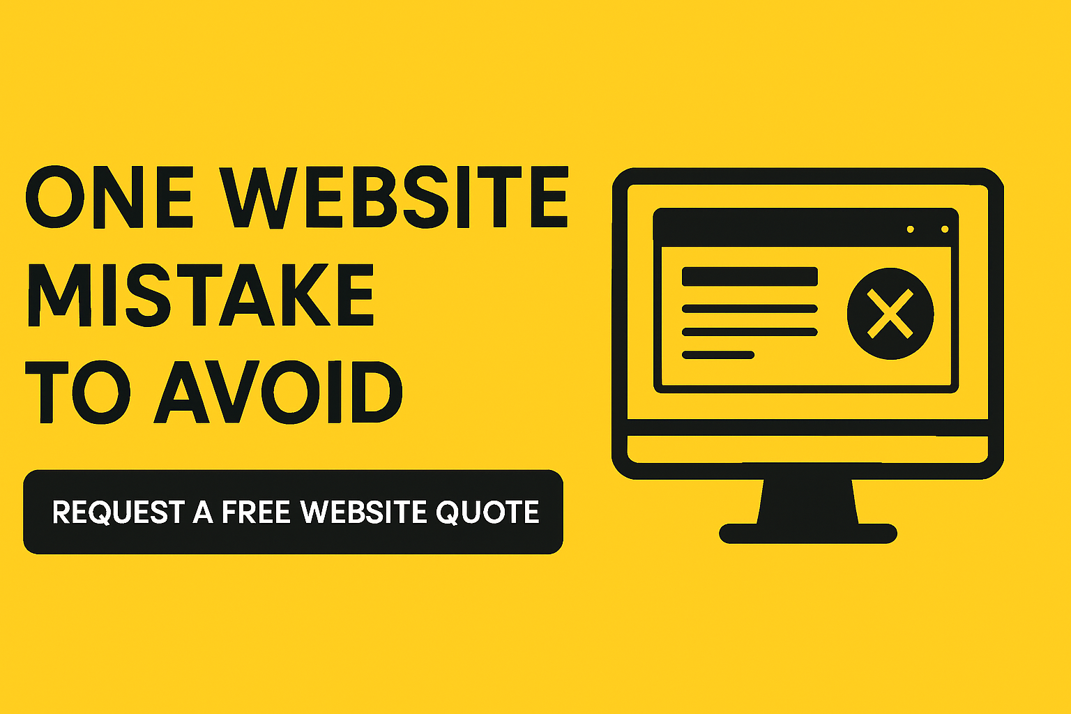
As someone who’s worked with small business websites for over 16 years, I’ve seen all types of mistakes. But there’s one that still surprises me—because it’s so simple to avoid, yet so costly when overlooked.
Let me share a quick story.
Recently, I visited a travel company’s website to inquire about their services. I had every intention to move forward, but I had one quick question first.
Naturally, I looked for their contact information.
And guess what?
- No phone number at the top
- No “Contact” tab
- No visible email address
My first thought was: If I can’t even get in touch with them, how can I trust them to deliver a professional service?
I scrolled. I clicked around. I checked the footer. Finally, I found a phone number tucked away at the very bottom of the homepage. And only on the homepage.
Then I visited another website, a clothing alteration company, found an email, sent a message, and it bounced back.
That’s when I realized…
Too many small businesses are unintentionally turning away potential clients.
What Happens When Your Contact Info Is Hard to Find
When your contact information is buried—or worse, broken—it sends the wrong message:
- It instantly raises a red flag
- It creates doubt
- And it breaks trust
If potential customers can’t find you, they’ll simply move on.
How to Fix It
Here’s how to make sure your website builds trust—not confusion:
1. Add a “Contact” tab in your main navigation
This is the first place people look. Label it clearly—“Contact” or “Contact Us.” Don’t bury it under another menu.
2. Include contact info on every page
Add your phone number and email in the footer so it appears site-wide. Even better, include it in your site’s header.
3. Test your contact methods monthly
Send a test email. Fill out your form. Make sure messages go through. I’ve seen too many broken forms and outdated email addresses.
4. Use both a contact form and a direct email address
Some people like forms. Others want to email you directly. Offer both.
5. Add a phone number to every page.
Make sure your phone number is visible on each page of your website—and clickable on mobile. One tap should initiate a call. This small detail can be the difference between a missed opportunity and a new client.
Final Thought
Your website should invite communication—not create barriers.
This isn’t just about being accessible. It’s about building trust, increasing credibility, and turning interest into action.
The good news? These are simple changes you can implement today—and they make a big impact.
Take a moment right now to evaluate your website:
- Is your contact information easy to find?
- Are you receiving your contact form submissions?
If not, now’s the time to fix it.