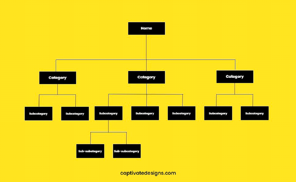
Your website serves as the virtual front door to your business. It’s the first impression you make on potential clients and a pivotal touchpoint for converting casual browsers into loyal customers. However, a common pitfall that many businesses encounter is a poorly organized website structure. This not only hampers the user experience but also significantly impacts your conversion rates, sales, and SEO performance. If navigating your website feels like wandering through a maze, it’s time for a redesign. Let’s explore how a well-organized website structure can turn clicks into clients and why it might be the key to unlocking your website’s full potential.
The Impact of Poor Website Structure
A website’s structure is the backbone of the user experience. A well-thought-out structure guides visitors effortlessly to the information or products they seek, while a disorganized one does the opposite. It’s not just about aesthetics; it’s about functionality. Websites that are difficult to navigate or find information on due to poor structure often see higher bounce rates, lower engagement, and, ultimately, decreased conversion rates. This is because users today expect instant gratification and will not hesitate to leave a site if they can’t find what they’re looking for quickly.
SEO and Click-Depth
One critical aspect often overlooked in website structure is its impact on Search Engine Optimization (SEO). Search engines like Google use bots to crawl websites, and a clear, logical structure makes it easier for these bots to index your site. This directly influences your site’s visibility and ranking on search engine results pages (SERPs).
Click-depth refers to how many clicks it takes for visitors to reach a specific page from the home page. The greater the click-depth, the less likely that page is to be found by both users and search engines. Pages buried deep within your website are less likely to rank well, which can lead to missed opportunities for attracting organic traffic. A rule of thumb for SEO-friendly website design is to ensure that the most important content is no more than three clicks away from the home page.
Evaluating Your Website Structure
To determine if your website suffers from structural issues, consider the following questions:
⦁ Can visitors easily find the most important content or pages within a few clicks?
⦁ Is your navigation menu intuitive and straightforward, or is it cluttered and confusing?
⦁ Are your URLs structured in a way that reflects the site’s hierarchy and content organization?
⦁ Do you have a clear hierarchy of information, with main categories and subcategories logically organized?
If you answered ‘no’ to any of these questions, it might be time to consider a redesign focused on improving your website’s structure.
Best Practices for a Conversion-Optimized Website Structure
⦁ Simplify Navigation: Keep your navigation menu simple and intuitive. Limit the number of menu items to avoid overwhelming visitors and ensure that labels are clear and descriptive. A practical rule to follow is to limit your main menu to seven items or fewer. By applying this rule, users are less likely to become overwhelmed with choices, which can otherwise deter them from taking action.
⦁ Adopt a Hierarchical Structure: Organize your content in a logical hierarchy, starting with the most general information at the top and getting more specific as you go down the levels. This not only helps users find information more easily but also improves your site’s SEO.

⦁ Ensure Mobile Responsiveness: With the increasing prevalence of mobile browsing, ensure your site’s structure is responsive and navigable on all devices.
⦁ Utilize Breadcrumbs: Breadcrumbs are navigational aids that show users their current location on the site and how they got there. They help users navigate your site more effectively and reduce click-depth.
⦁ Incorporate Clear Calls-to-Action (CTAs): Guide users towards taking the desired action (e.g., making a purchase or signing up for a newsletter) with clear and compelling CTAs.
By addressing these key areas, you can transform your website from a confusing maze into a streamlined pathway that leads visitors straight to what they’re looking for. This not only enhances the user experience but also boosts your SEO, leading to higher visibility, more traffic, and, ultimately, more conversions.